In August 2025, Cracker Barrel’s Logo was changed for what was the second time in nearly 50 years.. One week later, the change was erased, the stock price had fallen, and a nationally popular roadside restaurant chain was the focus of a nationwide conversation on branding, nostalgia, and identity. It’s been nearly 12 months since this came to light, and it’s one of the biggest logo failures in recent memory, so it should be a case study for anyone working with logos, brand identity, or design.
The Short Answer
Cracker Barrel has also undergone a broader rebranding effort, with a new logo, to refresh the brand, make it easier to spot on highway billboards and on smaller screens, and appeal to a younger and more diverse audience. The new design dropped the image of the man leaning on a barrel, “Uncle Herschel,” and “Old Country Store,” and added a streamlined “wordmark” with a gold background. The company’s reaction was swift and brutal, with the change being reversed after just seven days on August 26, 2025.
That’s the headline. The full story, one that was glossed over by most coverage: What happened to the design firm behind it, why the company’s leadership explained the decision months later, and what has transpired since then.
What the Old Logo Actually Looked Like
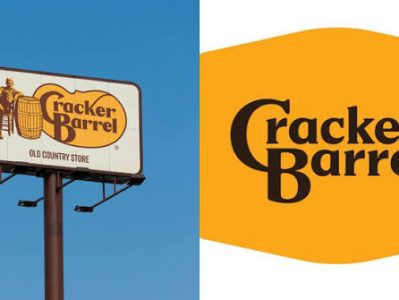
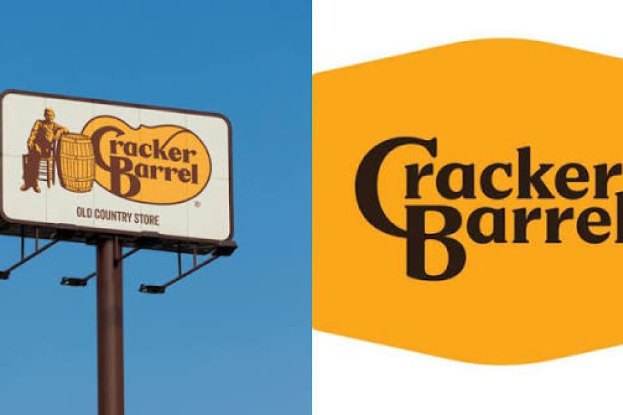
I guess if you have not followed Cracker Barrel’s branding (most of us until last August), it is important to explain what was at stake. “Uncle Herschel” is a silhouette of a man in overalls sitting and leaning on a wooden barrel, and was the original logo. The text below was in warm, rounded serif lettering, Old Country Store. It was a relaxed Southern ambiance, a visual porch rocking chair.
This logo has been around since 1977, when founder Dan Evins’ real-life uncle was the first person to use it, but the company has said the figure represents the spirit of an old country store, rather than the actual person. That image was displayed for almost 50 years on highway signs throughout the U.S. and was one of the most widely known restaurant logos in the country.
What Changed in the New Design
The new logo was unveiled on 19 August 2025 and took out almost all of the elements. Uncle Herschel was no longer. A picture of the barrel had not been found. “Old Country Store” was no more. All that was left were the words “Cracker Barrel” in a new font style, with a gold background, which was slightly distorted to form a barrel outline.
The new design is the brand’s “fifth evolution,” and the gold and brown colors were based on its scrambled eggs and biscuits, Cracker Barrel said. That’s what it did, it said, because it was not about one person, it was about all of its guests: “all races, colors, genders.
The logo change wasn’t released in isolation. It was part of the “All the More” initiative, which also involved plans to brighten up the interiors of Cracker Barrel’s more than 660 stores, replacing dark wood paneling and country-store knick-knacks with brighter, more contemporary furnishings and lighting.
Why Cracker Barrel Wanted to Change It in the First Place
It’s easy to view this as a puzzling move, but the reasoning was relatively typical of a company in Cracker Barrel’s shoes. There were probably a few reasons.
Ease of reading on small screens and signage. Logos that are detailed and illustrated can look great on a roadside sign, but often break down at app-icon size or in a mobile browser tab. One of the most frequent reasons for a brand to redesign in the last 15 years has been to simplify a mark so that it can be scaled up and down and retain its meaning across different formats.
The need to replace the aging customer base. The traffic at Cracker Barrel had been in decline for a number of years before the rebrand, and its most loyal users are, by definition, older. To appeal to younger patrons, the menu had to be more up-to-date.
A general trend in the industry is to become minimalist. Cracker Barrel was not the only one. Over the last ten years, there’s been a lot of big brands transitioning to flatter, simpler wordmarks, as part of a wider trend toward minimalism. It’s not totally irrational to follow the pattern. The issue was that it was being applied to a brand that was all about nostalgia and not modernity.
Why the Backlash Was So Intense
The new logo was not technically poorly designed, but the problem lay in the logo’s name. It was neat and easy to read. Clean and legible were never the original intent of the logo, and that’s what went wrong in the redesign.
A logo such as Cracker Barrel’s former logo is not merely a graphic but a representation of all the experience that has been built up over the years. It was the symbol of every road trip breakfast, of every peg game left on the table, of every rocking chair on the porch. Take away the symbol, and you’re asking yourself the question, is everything that it symbolized still present?
The Old Timer was more than a drawing for Cracker Barrel’s target audience. It was an indicator of stability and constancy that was important to those who valued just that kind of consistency. A substantial part of the company’s clientele apparently felt the change was not about typography, but about who the company was talking to when it took the figure out, and at the same time claimed to represent “all races, colors, and genders.
The reaction ran out of control very rapidly. In a matter of hours, terms such as “generic,” “soulless,” and “bland” were used on social media. The company’s share price plummeted, and reports indicate that they lost about $100 million in value. The debate went right to the top of the political discussion: then-President Donald Trump publicly demanded that Cracker Barrel return to its original logo, and members of the administration reportedly had direct contact with the company’s executives.
On August 26, seven days after the new logo’s launch, Cracker Barrel announced it was going back 180 degrees: “Our new logo is out and our ‘Old Timer’ will stay.
It Wasn’t Only the Logo
The standalone wordmark dominated the headlines, but the rebrand didn’t just involve a font and color change. In addition to “All the More,” Cracker Barrel had begun to renovate restaurant interiors, altering the physical space that the brand’s loyal patrons had frequented for years, if not decades.
A familiar physical environment that suddenly shifts into an unfamiliar one is a form of cognitive dissonance – a person walking through a familiar space and finding a different one. That kind of disruption can be worse for a brand that’s so much about physical ritual as it is about the drive-up, the porch, the gift shop, the biscuits.
Cracker Barrel also cancelled its planned restaurant renovations, about two weeks after flipping the logo on September 9, 2025. Within the span of a month, the entire strategic rebrand had been rolled out, one part at a time.
What Happened to the Agency Behind the Redesign
The turnaround wasn’t the end of the story. In early October 2025, Cracker Barrel announced its break with Prophet, the San Francisco-based design and strategy firm that had been advising on the logo change and restaurant redesigns. Prophet would not comment on the split publicly.
This is important because it indicates the extent to which the company handled the fallout internally. Breaking away from an external consultancy isn’t a symbolic act; it’s a recognition that the relationship and the strategic path it embodied were no longer practical.
How the CEO Explained It Months Later
A few months later, the CEO explains it to the board. A few months later, the CEO tells the board.
In October 2025, months after the reversal, Cracker Barrel CEO Julie Felss Masino again talked about the controversy at an investor summit. The rationale for the initial change was to ensure the brand’s signage was more visible to motorists on the highway, she said, and the redesign was not based on any ideology.
Even as acknowledging the short-term harm, Masino also painted the rebranding effort as a longer-term plan to transform the company. Company executives also responded to pressure from activist investor Sardar Biglari, who has sought changes on the company’s board for the last decade and who was quick to criticize the rebrand publicly at the same summit.
Where Things Stand in 2026
The financial situation began to improve in mid-2026. In a June 2026 earnings report, Cracker Barrel reported the same-store sales decrease was 2.6% year over year, down significantly from the 7.1% decrease in the previous quarter. Traffic dropped 6.7% compared to the previous quarter, when it fell 10%. The recovery is on track to be earlier than expected, and the executives increased their top-line outlook for the fiscal year.
To sum up, the brand suffered a serious blow to its finances, but it seems to be recovering from the initial blow more quickly than originally thought, nearly a year after the initial change.
How This Compares to Other Famous Rebrand Reversals
This is compared to other well-known rebrand reversals. This is compared to other rebrand reversals that are well known.
Cracker Barrel’s reversal of a redesign isn’t the first, but it’s certainly the quickest.
Gap, 2010. Gap unveiled a new logo in October 2010 and reverted within six days, a record at the time. Cracker Barrel’s replacement mark was more subject to criticism as being generic, although the criticism was more aesthetic than that of Cracker Barrel’s, which raised issues of identity and belonging.
Tropicana, 2009. PepsiCo overhauled the packaging of Tropicana with a more contemporary carton design, eliminating the orange and straw logo. It saw an estimated 20% decline in sales in the first two months, and the company incurred about $30 million in losses before making a comeback. The new packager was perceived as a general store brand by customers.
In both cases, and in Cracker Barrel’s case, the common denominator is the elimination of the visual elements that were unique to the brand and were built into recognition over the years, in the name of a cleaner look, often resulting in something that looks good, but says nothing.
What This Means If You’re Working With Logos
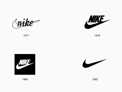
The Cracker Barrel tale is a cautionary tale for anyone who downloads or works with brand logos for design reference, study, or inspiration: A logo is not a graphic. It’s a layering of significance that takes time to form and can be easily lost. If you’re going to explore the development of a brand’s logo, including older versions that have been updated, you’re really doing a history of brand decisions at various moments in time.
It’s also another great reminder of the importance of the archived and historic versions of a logo. The “Uncle Herschel” mark was not only nostalgic, but it was also a brand equity construct that the company had developed over almost five decades. One of the easiest ways to see why a logo redesign works or doesn’t is to compare the old version with the new one, as many design resources and logo libraries do.
Frequently Asked Questions
Why did Cracker Barrel change its logo?
The company was looking to rebrand, as part of a wider initiative in August 2025, to a simpler mark to be more legible on highway signage and smaller screens, and to make the mark more appealing to a broader, more diverse customer base.
What was different between the old and new Cracker Barrel logos?
The initial logo included the text “Old Country Store” in a warm serif font and the figure of “Uncle Herschel,” a man leaning on a barrel in overalls. The new logo scrapped the illustration and replaced it with the words “Cracker Barrel” in a simplified font on a gold background.
Did Cracker Barrel really reverse the logo change?
Yes. Following the furor, the stock plummeted, and then-President Trump weighed in on the logo controversy. The company announced on August 26, 2025, seven days after the new logo was released, that it was reverting to the original name.
Did Cracker Barrel cut ties with the company behind the redesign?
Yes. In October 2025, Cracker Barrel confirmed it had ended its relationship with Prophet, the consultancy that advised on the logo change and restaurant remodel plans.
Has Cracker Barrel recovered from the controversy?
In finance, the company’s recovery seems to be quicker than anticipated. By the time of its June 2026 earnings call, same-store sales losses were much smaller than they had been in the previous quarter, leading to an upward revision in full-year sales expectations.
What can other brands learn from Cracker Barrel’s logo controversy?
That the clean-cut or the cool design of a logo isn’t always the most important aspect of its brand equity, sometimes it’s the details. Sometimes, the details of a logo are what make the brand. Taking those details away can create something more modern, but without the recognition and emotional connection that was earned over the years. Explaining ‘why’ a design is needed is at least as important as the design itself and is even more important if it is explained early enough before the redesign is implemented.