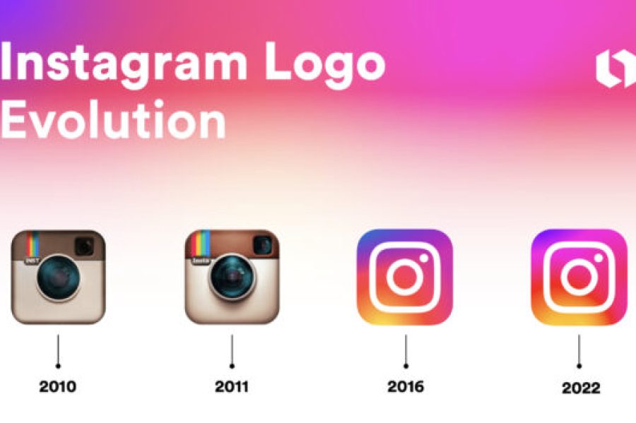
If you’ve used Instagram for more than a few years, you’ve probably noticed the logo hasn’t always looked the way it does now. The Instagram Logo history actually goes through a pretty clear before-and-after moment, and there’s a reason the app made that switch.
The Original Instagram Logo (2010–2016)
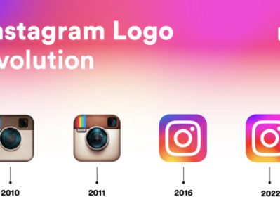
When Instagram launched back in 2010, the logo was a detailed, retro-style camera brown leather-like texture, a rainbow stripe across the top, and a small viewfinder in the corner. It was designed to look like an actual vintage camera, which made sense at the time since Instagram’s whole identity was built around filtered, nostalgic-feeling photos.
That version stuck around for about six years and became instantly recognizable it’s the icon a lot of long-time users still picture first when they think of the app.
The 2016 Redesign
In 2016, Instagram switched to the flat, simplified camera outline with the purple-to-orange gradient background that’s still in use today. The change was a big departure from the detailed, skeuomorphic style, and honestly, it wasn’t received well at first a lot of users online called it too plain compared to the old version.
Over time though, the new design proved to be more practical. It scales better across different screen sizes, looks cleaner as a small app icon, and matches the flatter, more minimal design trend that most major apps shifted toward around the same period.
Why the Design Changed
A few practical reasons drove the redesign:
- Better scalability: the detailed camera icon lost clarity at small sizes, especially on phone home screens
- Brand consistency: Instagram wanted a look that matched Facebook’s (its parent company at the time) broader design direction
- Modern app trends: flat, gradient-based icons had become the norm across most major platforms by the mid-2010s
What the Current Logo Represents
The gradient itself moving through purple, pink, orange, and yellow was meant to feel warm and energetic without tying the brand to one specific color, unlike, say, Facebook’s blue or Twitter’s original bird-blue. The simplified camera outline keeps the core idea (it’s still a photo/video app) without the retro clutter.
Quick Timeline
- 2010: Original detailed camera logo launches with the app
- 2016: Flat gradient camera icon replaces the original design
- 2016–present: Minor refinements to the gradient and icon weight, but the core design has stayed the same since the 2016 switch
Where to Find the Instagram Logo Today
If you need the current version of the logo for a project a presentation, a blog graphic, or a social media post you can find it in our Social Media Logo Collection, available in PNG, SVG, and transparent formats.
FAQs
Why did Instagram change its logo in 2016?
The old camera-style icon was hard to read clearly at small sizes, especially on phone home screens. Instagram switched to a flatter, simpler design that scales better and matches the design direction most major apps were moving toward at the time.
What was the original Instagram logo?
The original logo, used from 2010 to 2016, was a detailed brown camera with a rainbow stripe across the top and a small viewfinder built to look like a retro instant camera.
What do the colors in the Instagram logo mean?
The gradient runs through purple, pink, orange, and yellow. It wasn’t tied to one specific meaning the goal was a warm, energetic look that didn’t lock the brand into a single color the way Facebook’s blue or the old Twitter bird did.
Has the Instagram logo changed since 2016?
Not in any major way. There have been small refinements to the gradient tone and icon spacing over the years, but the core flat-camera design from 2016 is still what’s in use today.
Who designed the current Instagram logo?
The 2016 redesign was done in-house by Instagram’s design team as part of a broader visual refresh that also updated the app’s interface, not just the icon.
Is the old Instagram logo still used anywhere?
Not officially. Some fan content, nostalgia posts, and older app screenshots still show it, but Instagram itself has used the flat gradient version exclusively since 2016.