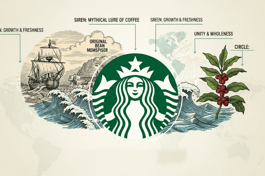
If you’ve ever grabbed a coffee and looked twice at that green circle on the cup, you’ve probably asked yourself: what is the Starbucks Logo actually supposed to be? It’s not a crown, not a wave it’s a mermaid. Specifically, a two-tailed sea creature called a siren, and there’s a real story behind why she ended up on millions of coffee cups worldwide.
Where the Starbucks Logo Came From
Starbucks opened its first store in Seattle in 1971, started by three friends Jerry Baldwin, Zev Siegl, and Gordon Bowker. When it came time to design a logo, they hired designer Terry Heckler, who dug through old marine and Norse imagery looking for something tied to the sea and to Seattle’s history as a port city. He landed on a 16th-century Norse woodcut of a twin-tailed siren, and that became the starting point for the logo we still see today.
What Does the Starbucks Siren Actually Mean?
The siren was chosen because of the seafaring connection coffee, after all, arrived in Seattle by ship, and a mythical sea figure fit that story. The original version from 1971 was brown, circular, and honestly a lot more explicit than the version you see now the siren was bare-chested, in the style of the old woodcut it was based on.
How the Logo Changed Over the Years
1971 The Original Mark Brown and white, with the siren shown in full detail, surrounded by the words “Starbucks Coffee Tea Spices” around the border.
1987 The Green Era Begins When Howard Schultz’s Il Giornale coffee company merged with and took over Starbucks, the logo shifted to the green color scheme that’s now synonymous with the brand. The siren was also simplified and cropped so she was less explicit than the original.
1992 Zoomed In and Cleaned Up The image was cropped in further, making the siren look more abstract and less like a literal mermaid illustration. This version still kept the “Starbucks Coffee” wordmark wrapped around the circle.
2011 The Wordmark Disappears For the company’s 40th anniversary, Starbucks dropped the text entirely. What was left was just the green circle and the siren no name, no border text. This was a bold move, but by that point the brand was recognizable enough that the icon alone could carry it, similar to how Nike relies on just the swoosh.
Why the Green Color?
Green wasn’t originally part of the brand it came in through the 1987 merger with Il Giornale, which used green as part of its own identity. Once it stuck, it became one of the most recognized brand colors in the world, right up there with Coca-Cola red or McDonald’s yellow.
Why Drop the Name From the Logo?
Removing the wordmark in 2011 was a calculated risk. Most companies keep text in their logo because name recognition matters, especially for younger brands. But by 2011, Starbucks had over 30,000 stores globally, and the siren alone was already doing the job of identifying the brand. Dropping the text let the logo work better at small sizes app icons, cup lids, small signage without looking cluttered.
What Brands Can Learn From the Starbucks Logo
The Starbucks logo shows that a strong symbol can eventually outgrow the need for a name attached to it. That’s not something every brand can pull off it takes years of consistent visibility before an icon alone is enough. Starbucks earned that shift gradually, through decades of the same core siren image showing up everywhere, rather than changing direction all at once.
Looking for more restaurant and coffee brand logos? Browse our Food and Drinks Logo Collection for free PNG, SVG, and vector downloads.
FAQs
What is the Starbucks logo supposed to represent?
It’s a two-tailed siren, a mythical sea figure based on a 16th-century Norse woodcut, chosen to reflect Seattle’s history as a coffee-importing port city.
Why is the Starbucks logo green?
The green color came from Il Giornale, the coffee company that merged with Starbucks in 1987. Before that, the logo was brown and white.
When did Starbucks remove the text from its logo?
In 2011, for the company’s 40th anniversary, Starbucks dropped the “Starbucks Coffee” wordmark and kept only the siren icon.
What did the original 1971 Starbucks logo look like?
It was brown and white, showing a more detailed, bare-chested siren surrounded by the words “Starbucks Coffee Tea Spices.”
Is the Starbucks siren a mermaid?
Close, but technically she’s a siren a two-tailed figure from mythology, not a traditional single-tailed mermaid.