You have seen the Nike logo many times. It is a simple curved line called the Swoosh. It has no text. But everyone still knows it means Nike. The nike logo history behind this simple shape is a great story. It starts with a $35 payment. It ends with one of the most famous logos in the world.
How Nike Started
Nike did not always have this name. In 1964, Bill Bowerman and Phil Knight started the company. At first, they called it Blue Ribbon Sports. They sold running shoes from the back of a car. In 1971, the company changed its name to Nike. That same year, they needed a new logo.
The $35 Logo
Here is the interesting part. A college student named Carolyn Davidson designed the Swoosh. She was studying graphic design at Portland State University. Phil Knight used to teach classes there. When Nike needed a logo, they asked her to make one. She got paid only $35 for it.
Davidson did not try to draw a checkmark. She wanted the logo to show speed and movement. She wanted it to feel fast, just by looking at it. That idea worked very well.
From Text and Logo to Just the Symbol
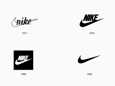
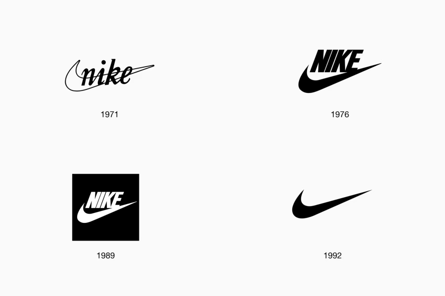
In the early years, the Swoosh did not stand alone. It appeared next to the word “NIKE” in bold letters. For a long time, people knew the brand by seeing both the word and the symbol together. Slowly, Nike started using just the Swoosh by itself. The shape became so famous that the company did not need the word anymore. People already knew what it meant.
This happens with only a few big brands. A logo becomes so well known that the company can remove the name completely.
“Just Do It” Joins the Brand
In 1988, Nike created its famous slogan: “Just Do It.” This slogan is not part of the logo itself. But in ads, the slogan and the Swoosh appear together so often that people think of them as one thing. Together, they became the heart of Nike’s brand for many years.
Why the Swoosh Still Works Today
One important part of the nike logo history is this: the shape has barely changed since 1971. There have been small updates. The lines got cleaner. The size changed a little for different uses. But the main shape has stayed the same for over 50 years. This is rare. Most brands change their logo more often. This long history is a big reason why the Swoosh became so valuable. People have seen it for decades. Now they recognize it instantly.
What Happened to Carolyn Davidson Later
Years after her $35 payment, Nike gave Carolyn Davidson a better thank-you gift. They gave her company stock and a gold ring shaped like the Swoosh. This happened after Nike became a huge, successful company. She later stopped doing freelance design work. She spent time volunteering, including at the Ronald McDonald House.
FAQs
Who designed the original Nike logo?
Carolyn Davidson designed it in 1971. She was a graphic design student. She was paid $35 for the work.
What was Nike called before it was Nike?
The company started in 1964 as Blue Ribbon Sports. It became Nike, Inc. in 1971.
What does the Swoosh mean?
It does not represent one specific object. It was made to show speed and motion.
When did “Just Do It” start?
Nike introduced this slogan in 1988. It has been closely linked to the Swoosh in ads ever since.
Has the Nike logo changed a lot?
Not much. The main shape has stayed almost the same since 1971. Only small details have changed.